-
Architects: Haeccity Studio Architecture
- Area: 12000 ft²
- Year: 2017
-
Photographs:Krista Jahnke, Andrew Latrielle
-
Manufacturers: AEG, Blomberg, Karndean, Nevamar, Whirlpool
-
Lead Architects: Travis Hanks

Text description provided by the architects. Haeccity Studio Architecture, a Vancouver-based practice, recently completed a major revitalization of a 3-storey, wood-framed 1920s character building that accommodates 19 rental units. The historic building located at 2930 Cambie Street maintains its modest yet engaging street presence along Cambie Corridor, one of the city’s major arterial routes.

“We wanted to give new life to an old building, while simultaneously honouring its previous contribution to the city,” explains Travis Hanks, Haeccity Principal, “At a time when buildings are disappearing along the Cambie Corridor, we had an opportunity to ensure these homes would flourish into a new era.”

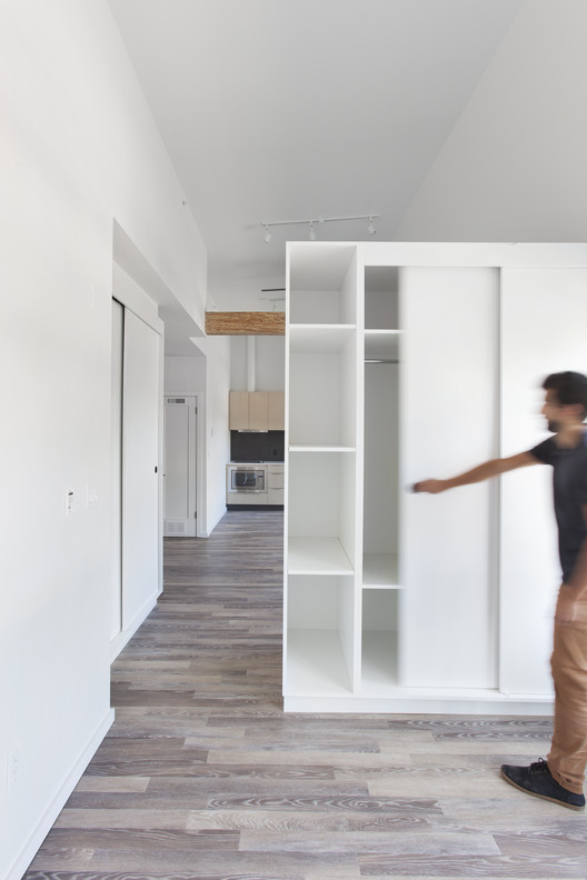
The project involved a comprehensive upgrade of all systems and interiors, including a more effective suite layout that resulted in an additional 5 units and new shared amenity spaces. All the units were updated to align with contemporary lifestyles, complete with modern fixtures and built-ins.

For nearly a 100 years, passersby on Cambie could look through a celebrated front entry to a stair leading directly to upper levels. This common Vancouver feature, however, poses a number of serious challenges in terms of egress, accessibility, and life safety. To extend the building’s life, a solution emerged in the form of a clearly demarcated “insertion” into the character structure, a new modern stair and lobby that stood in clear distinction to its heritage context. Turning on its head the notion of history as a black and white photo, the new, modern stair intervention is rendered in neutral black and white, leaving the existing construction to endure in living colour.

As this was the first renovation in the building’s history, a large accumulation of antiquated building components were discovered - a kind of architectural archive of obsolete building technologies. The design team realized early on the importance of finding a meaningful way to physically and conceptually embed these objects and materials in the building’s new expression.

“These components convey traces of the building’s history, while preserving the narratives of its previous inhabitants,” says Shirley Shen, Haeccity Co-founder, “The idea of retaining and reusing the materials with ingenuity guided the renovation’s design.”

Plaster on lathe, inlaid oak flooring, cast iron tubs, and wood panel doors were all refurbished in place. Areas that were too damaged to remain were carefully removed, stored, and up- cycled into new installations. Pre-electric iceboxes became workshop cabinets; concrete laundry sinks became planters; old-growth douglas fir was crafted into custom furniture. Cast iron furnace doors, single-hung window weights, antique lock sets, brass doorknobs, doorbells and hardware were all preserved, and integrated back into the building.


